[Case study] Kohde for Lyra Southern Africa
The system behind an executive health assessment day
- Executive wellbeing system
- Live since mid-2024
- 2024 to present
Lyra Southern Africa, formerly ICAS, supports employee wellbeing across hundreds of organisations. Their executive offering puts a senior leader through a full day of clinical assessment and hands them a report at the end of it. The day itself ran on people, paper and coordination. My job was to design the system that holds it together.
- Client
- Lyra Southern Africa, formerly ICAS
- My role
- Sole designer, analysis through QA
- Timeline
- January to March 2024, support ongoing
- Status
- Live since mid-2024
Context
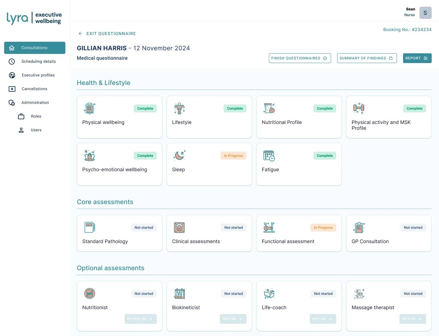
An executive assessment is not a doctor's appointment. A senior leader at a large employer, a bank for example, is invited as part of their package. Before they arrive they complete questionnaires covering physical wellbeing, lifestyle, nutrition, physical activity, psycho-emotional wellbeing, sleep and fatigue. That gives the medical team a picture of the person before the person walks in.
On the day they move through standard pathology, clinical assessments covering cardiac and respiratory measures, a functional assessment and a GP consultation, with optional services alongside: a nutritionist, a biokineticist, a life coach, a massage therapist. At the end they receive a report on their physical and mental health with recommendations, sometimes including a specialist referral. Several professionals touch the same executive on the same day, none of them able to wait on another to finish first.
The problem
Underneath the clinical detail, the assessment day is really a coordination problem. Every person in the building needs the same two answers at any moment: where is this executive up to, and what is still outstanding. Without a shared view, that answer lives in whoever happens to be holding the file.
The real design question was how to keep a day with many moving parts legible to everyone running it, without slowing any of them down.
Two constraints shaped everything: the clinical content is not negotiable, and the day is interruptible, because an executive gets called away or a machine is in use and a module is picked up later.
My role and process
I was the only designer on this. I ran it from first conversation through to design QA during the build, which meant the analysis and the interface were never handed between people.
On site with the client
I spent time at Lyra's offices rather than working from a brief. I watched how the assessment process was meant to run and asked the people who run it what actually happens, which is where the interruptions, the skipped modules and the waiting surfaced.
Requirements and functional spec
I ran the requirements elicitation and wrote the functional specification, so the clinical content, the roles and the rules were settled in writing before anything was drawn.
Journeys, then low and high fidelity
I mapped the journey from the executive's invitation through to their report, then worked through low fidelity into high fidelity, reviewing with both the clinical staff who would use it and the business who commissioned it.
Handover and QA
I ran the handover into development and stayed on through the build for design QA, so what shipped matched what was specified.
Low fidelity
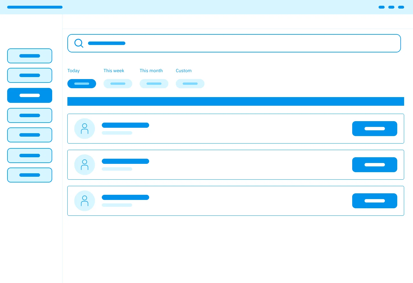
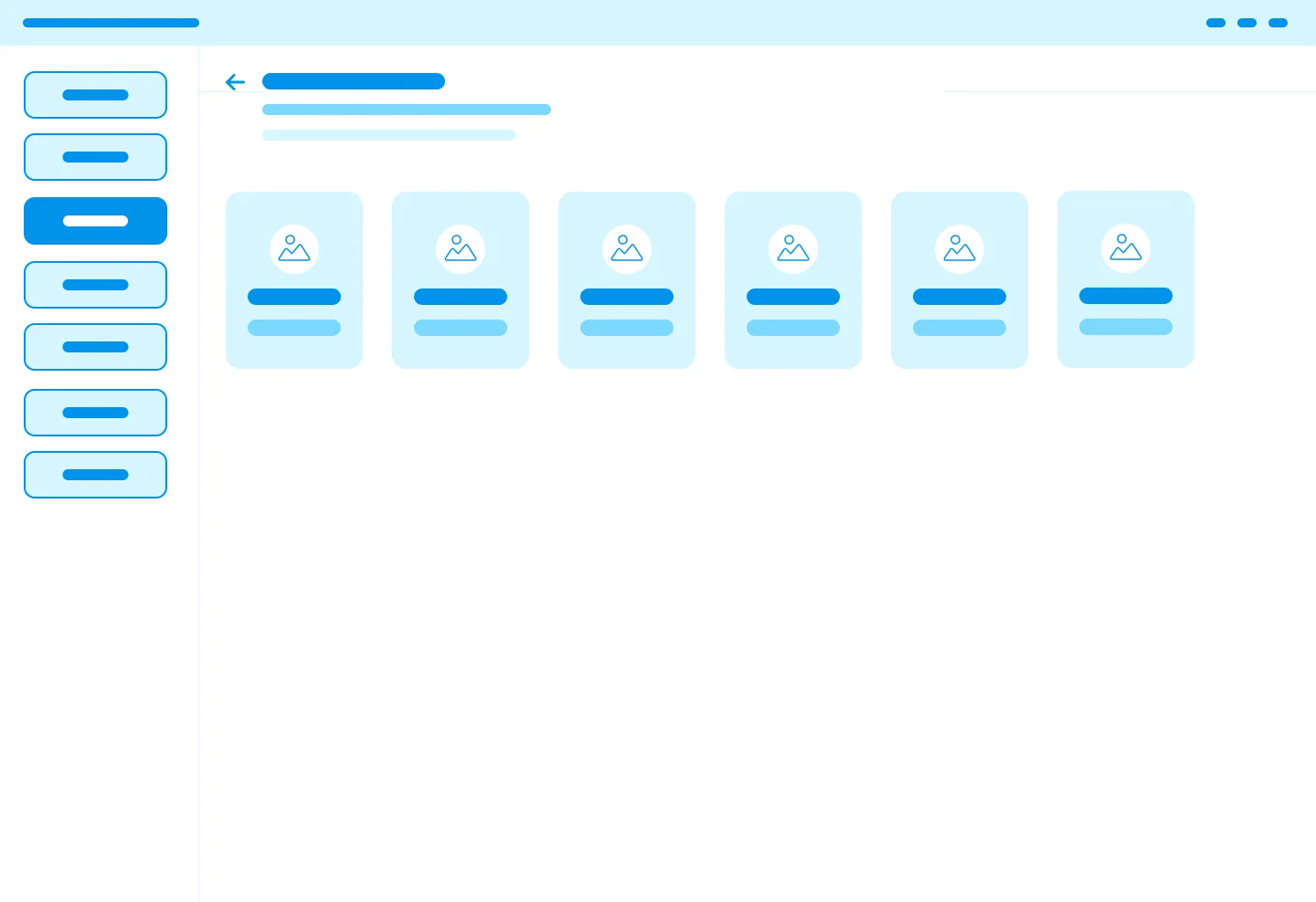
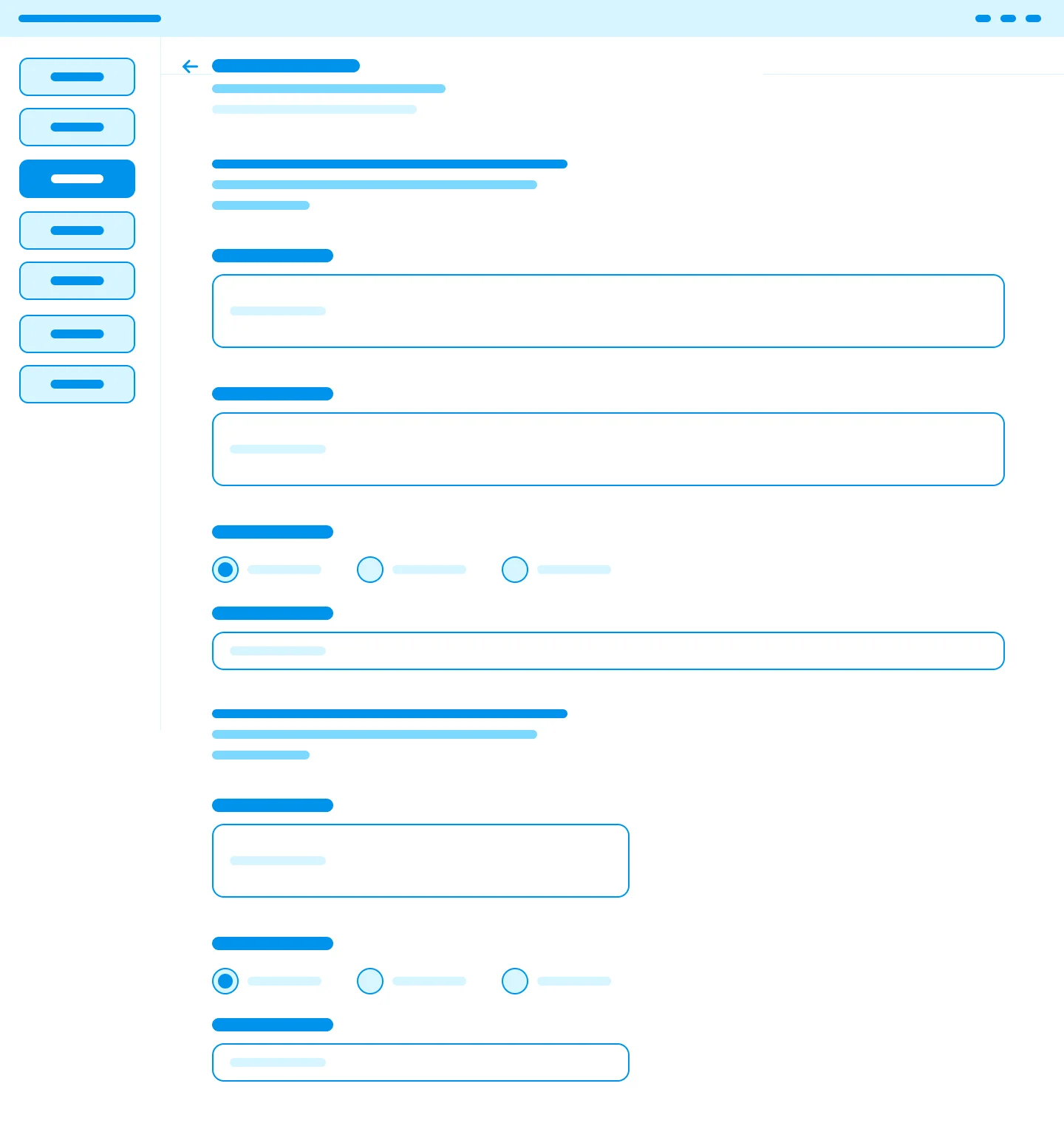
The wireframes settled structure before anything else. Three questions got answered here: how a nurse finds the right appointment, how the day's modules are grouped, and how a clinical form behaves when it is long.
The module dashboard
This is the screen the day runs on. Every assessment for one executive, grouped into Health and Lifestyle, Core assessments and Optional assessments, each carrying its own state.
Decisions worth naming
- Status on every card, not a progress bar. A single percentage would say the day is 60% done without saying which room to walk to next. Per-module state answers the question staff actually ask.
- Three groups, not one list. Questionnaires the executive completes, core clinical assessments, and optional services are different in kind, funded differently and owned by different people. Flattening them would have hidden that.
- In Progress is a first-class state. The day is interruptible by nature, so a module that is open and unfinished had to be as visible as one that is done.
- Opt-in on the card itself. Optional services are sold and chosen, so the decision point lives where the service is described rather than in a separate booking flow.
Capturing clinical data
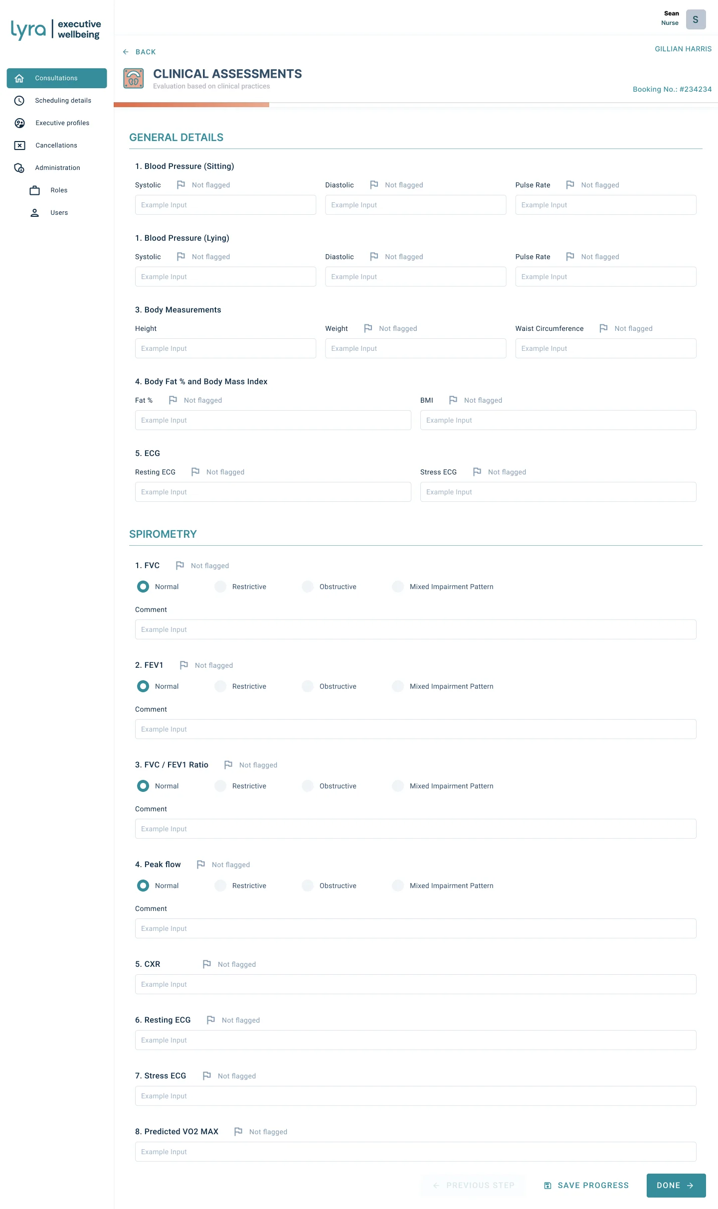
The clinical assessment form is where the design stays out of the way. The content comes from clinical practice, so the work was in everything around it.
Decisions in the clinical form
- A flag against each measure. Every reading can be flagged, so a nurse marks something for attention as they capture it rather than remembering it for the report later. The flag is the bridge between capture and the findings the executive eventually reads.
- Save progress sits next to Done. Half a form is a normal state here, not an error. Making the partial save equal in weight to completion matches how the day actually runs.
- Sections carry their own numbering. Clinical staff refer to measures by name and order, so the form follows their sequence instead of being reorganised for visual balance.
- Comment fields under classified results. Where a result is a category, normal, restrictive, obstructive or mixed impairment, a comment sits directly beneath it, because the category alone loses the nuance a clinician needs to record.
Outcome
- LiveIn production since mid-2024, running continuously
- 100+Executive assessments a month, confirmed with the client
- ThousandsAssessments completed on the platform since launch
The platform has been in continuous use since it went live, pausing only over the holidays. I still support Lyra on it today, which means the decisions above have been tested by two years of real assessment days rather than by a review meeting.
Reflection
If I picked this up again, I would go after the steps it takes to get an executive from arrival to their wellness report. There is still a lot of back and forth between modules. I would streamline that into a role-based stepper, so a clinical professional is guided through their part of the assessment to completion instead of choosing where to go next each time.